This series features mid-course projects for our Data Science Bootcamp. Students were first tasked with posing an interesting data question and finding a dataset to address that question. Next, they spent time cleaning, wrangling, and exploring the data, before designing and building an interactive Shiny app to display their findings and allow for further exploration.
All Roads Lead To Traffic
Inspired by the beauty and ingenuity of the road system that helps us traverse the country, Matt Parker of Data Science Cohort 4 was interested in exploring traffic and population growth across Tennessee. While the pandemic may have temporarily erased Nashville’s commute, with more people moving to Nashville every day and the cost of housing driving people out to the suburbs, it’s reasonable to expect the daily commute into Nashville will eventually return for many.
The Data Question
For his mid-course capstone project, Matt asks, Where are Tennessee’s roads being impacted the most by population growth? To answer this question, he used TN GIS Traffic Counts, daily traffic counts conducted by the Tennessee Department of Transportation (TDOT) at over 12,000 stations in all 95 counties, and population and commute times from the US Census.
Cleaning The Data
Matt’s first challenge was to sift through the available data sources to find data that was best suited for his capstone project. “I communicated with some employees at Tennessee’s Department of Transportation (TDOT) who were incredibly helpful and gave me some extremely comprehensive data about every road in the state,” he shared. ‘It was honestly at a larger scale than I was able to handle at this time, but I would love the opportunity to go back and tackle it at a later date.”
For data preparation and cleaning, he used R’s tidyverse packages. Population data from the US Census Bureau was incorporated with the help of the censusapi library. Finally, the sf library was used for handling the project’s geospatial data.
Visualizing The Data
Matt’s Shiny app opens on a homepage that provides information about his project. On the State Trends tab, Matt explores county-level trends in population growth, commute times, and traffic volume between 2011 and 2018. Users can select their variable, like Average Commute Time, and see the commute times for all the counties where data was available. Users can also look at the commute times by each year, or push the play button to watch how commute times have changed over the years.
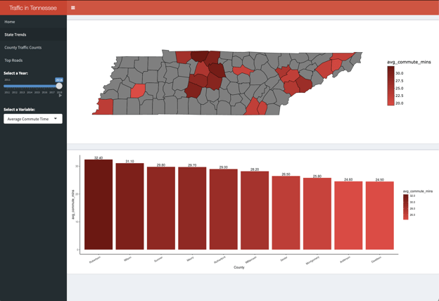
A look at average commute times across the state for 2018.
The next tab, County Traffic Counts, displays two plots. On top is a leaflet map showing the volume of traffic recorded at each traffic station in a selected county. Below the map is a scatterplot comparing the growth in traffic at a given station to the traffic volume recorded at that station. The two plots are linked so that the user can select one or more points in the scatterplot and then see the corresponding station locations displayed on the map. For example, if you want to see where high trafficked roads have seen the highest percentage of traffic growth, you can select the points on the scatterplots in the upper-right corner. Users can also click on the dots on the map to see information specific to that road.
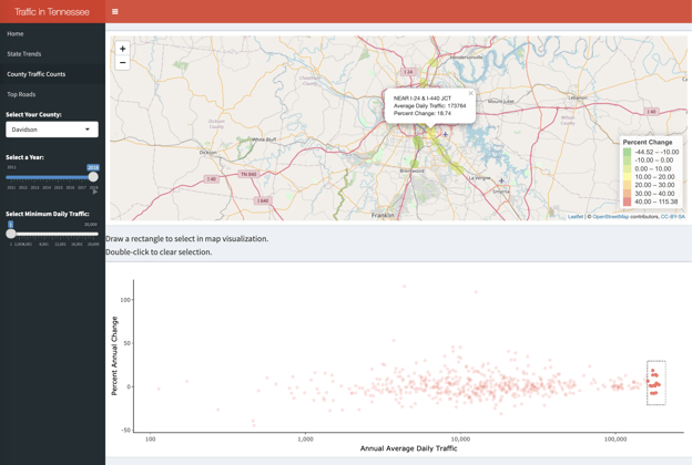
Traffic counts in Davidson County for 2018, with the highest trafficked roads selected in the scatterplot and shown on the map.
“Traffic is something that is always on people’s minds in Nashville, and I wanted to give users a very personal connection with this data by creating maps where they can zoom in and easily inspect what’s going on with the roads they travel on a daily basis,” Matt shares. ‘Users will be able to easily see patterns of where traffic is building up now, and hopefully this app can be used as a first step for identifying where future road projects will be needed to relieve congestion.”
Finally, the Top Roads tab allows the user to zero in on the roads having the fastest growth in traffic volume across the whole state of Tennessee. These visualizations have the same features as the County Traffic Counts but also include an additional layer showing population, population growth rate, or other metrics by county to try to uncover some insights into the question driving the analysis
To create his visuals, Matt used leaflet, ggplot2, and plotly. He used RColorBrewer and scales for formatting.
The Results
“The main takeaway largely confirms what we already know is true - traffic is building the heaviest in the southern and eastern suburbs of Nashville, particularly around I-840,” Matt explains. “I had expected there to be more growth in the city centers for both Nashville and Memphis, but that really wasn’t the case. I think we’re seeing a trend of the suburbs becoming increasingly self-sufficient, with more work and entertainment opportunities following the housing migration to the suburbs.”
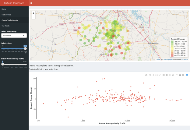
Traffic counts in Williamson County for 2018, showing multiple areas with a high percentage of change in traffic counts from 2017 to 2018, particularly along I-840 and I-65.
While Matt’s analysis was focused on roads, he also acknowledged that one solution to congested traffic is mass transit. He explains, “Our roads are crowded, but we have many challenges to developing a viable system of mass transportation. Good transit requires dense development; however, as Nashville continues to grow into lower-density areas, as opposed to increasing density of already developed neighborhoods, it will only become more difficult and more expensive to keep up with the cars on the roads.”
Matt hopes to take this project a step further by incorporating upcoming construction projects and information he received from employees at TDOT.