This series features mid-course projects for our Data Science Bootcamp. Students were first tasked with posing an interesting data question and finding a dataset to address that question. Next, they spent time cleaning, wrangling, and exploring the data, before designing and building an interactive Shiny app to display their findings and allow for further exploration.
There are more than 35,500 endangered species on the IUCN Red List. With a problem so large, how do you even know where to start finding solutions? Inspired by her time living near Mauritius, Armelle Le Guelte of Data Science Cohort 4 decided to explore endangered species in her mid-course capstone.
The Data Question
“I always have been fascinated with animals,” shares Armelle. “I used to live in a tropical island next to Mauritius island (east of Madagascar in the Indian ocean) and I learned about the infamous story of the dodo, a bird that looked a little bit like a turkey. This bird was endemic to the island of Mauritius and was thriving before humans discovered the island. It was then hunted by sailors and was extinct in less than a century after it was discovered. [Like the] dinosaurs, we have little information of [the dodo’s] exact appearance. Nowadays, there are several species that are in high risk of extinction such as the Orangutan, the Bengal tiger, the blue whale, the black rhino, and the Florida panther.”
To help educate others through her findings, Armelle set out to answer the questions of where the endangered and threatened species are located and the causes for their endangered status.
Cleaning The Data
Armelle’s first challenge was to find data that met her requirements for the app, which included a photo of the animal, its location, and the reason why the animal is endangered. She was able to find most of the information through ECOS (Environmental Conservation Online System) from the U.S. Fish & Wildlife Service.
She met her next obstacle when trying to identify each animal. All of the species had a scientific name, such as "Loxodonta africana." However, she wanted her app to show the corresponding common name, like "African elephant." She quickly found that this was not always possible since a large number of species had missing common names. This was often encoded in the data as "No common name." Including a photo of each species presented another challenge. “There were image duplicates of species, sometimes with a different id number,” she describes.
Another of Armelle's goals was to allow the user to drill down into the data for a particular state or country. She had to think carefully about how to structure the data and what type of visualization would be effective for showcasing this. “I had to modify the data so I could use it in a multilevel treemap in plotly,” she states. Finally, she wanted to display the geographic location of each species. This proved to be a challenge since the location data was in a format not readily usable in R, as she explains, “I also had to convert the polygon data to be readable in R by using shapely to convert the data in geojson files in Python.”
Visualizing The Data
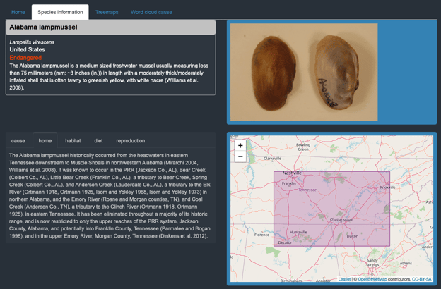
Armelle’s app opens on a home tab that gives an overview along with three tabs for the user to explore and learn more about endangered species. The Species Information tab gives an overview of each species, including a photo and a map of their location, created with the leaflet package. Users can pick the species group and then the species they want to explore. This reveals the available data on why they are endangered (the cause), their location, such as the Emory River in Tennessee where you’ll find the Alabama Lampmussel, their habitat, diet, and how they reproduce, integral for saving them from extinction.

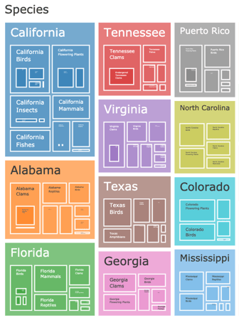
The next tab includes two treemaps providing an interactive visual representation of which states and countries have the most endangered species. By clicking on a box, users can drill down to explore their state (or country) and see the breakdown by species group and status (endangered, extinct, threatened, or of concern).
Finally, the word cloud tab highlights reasons why species are endangered. This visualization shows the most frequently-occurring words in the description of the causes of endangered status. She created the word cloud using the wordcloud2 library with the help of the RColorBrewer package to customize the color scheme.
The Results
Armelle discovered several interesting findings during her analysis, sharing that, “Several endangered species are only localized in small territories in the United States and this could explain why they are endangered and can't thrive. For example Hawaii harbors several endangered species despite a small territory.” Another indication that shrinking territories could be an important factor is that “habitat” and “loss” were the most common words in the word cloud.

Endangered species in Hawaii.
The treemap also sheds light on the fact that Tennessee is ranked fourth in the number of endangered species! While not as visible as other species, clams such as the Cumberlandian combshell and the fat pocketbook account for 61% of Tennessee’s endangered species.

Top 11 States/Territories for Endangered Species in the U.S.
Armelle hopes to revisit this project to expand it to more species and incorporate the impact of extinction, like the imbalance in the food chain and loss of biodiversity. The more we can learn about why certain species are endangered, the more we can do to protect them.


