This series features mid-course projects for our Data Science Bootcamp. Students were first tasked with posing an interesting data question and finding a dataset to address that question. Next, they spent time cleaning, wrangling, and exploring the data, before designing and building an interactive Shiny app to display their findings and allow for further exploration.
Sports fans across the world can’t wait to get back into the stadiums to cheer on their favorite team. For Taylor Franklin of Data Science Cohort 4, that team is the Nashville Predators. “As a life-long player and fan, I’m fascinated by the statistical components of hockey,” he shares. “Statistics are often used in sports to evaluate teams and players—something I’ve enjoyed learning about and applying in my fandom. This project was an opportunity to dive into a passion of mine and learn what makes the best players in the National Hockey League (NHL) so effective.”
The Data Question
Taylor's objective for this project was to take a data-driven approach to identifying the NHL's best players during the last three seasons. The question of "who is the best player" is a subjective one, even with data, so Taylor focused his analysis on a few key performance metrics. He started with traditional production measures such as goals and assists but wanted to add another dimension and included some second-level statistics such as time of possession (measured by the number of shot attempts) and shot quality. These more advanced metrics can help to paint a fuller picture about the real contribution of a player.
Cleaning The Data
Taylor was able to source his data from MoneyPuck.com, a website that tracks NHL statistics. Fortunately, the data was fairly clean, so his biggest challenge was combining the multiple CSV files that he retrieved into a single data set. For this task, he used the R programming language and its tidyverse collection of packages.
Visualizing The Data
To visualize the data, Taylor first used interactive, searchable tables to provide context to where a player ranks (a familiar visual for rankings). Next, he included bar charts to look at the top 10 scorers and break down their scoring by situation type. Finally, scatterplots were included to look at ice time versus points scored, compare a players’ offensive and defensive possession metrics, and to analyze the expected versus actual goals scored by player and team.
The Results
Taylor identified three findings from his analysis.
1. Nashville Predators (2018-2019)
“As a fan of the Nashville Predators, I really enjoyed looking at how effective the team was in the 2018-2019 season,” he shares. “When looking at possession numbers and shot quality statistics specifically, the Preds' top line of Viktor Arvidsson, Ryan Johansen, and Filip Forsberg soared above league averages in each category.”
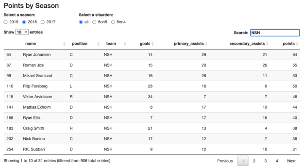
Top 10 players ranked by points for the Nashville Predators, 2018-2019 season.
2. MVP (2019-2020)
In another analysis, he revisited the 2019-2020 league Most Valuable Player race in which Leon Draisaitl of the Edmonton Oilers edged out runner up Nathan MacKinnon of the Colorado Avalanche to take the MVP crown. Taylor looked at how these two players stacked up in terms of the metrics he was analyzing to see if there could be a case that the voters had gotten it wrong.
“Using the statistics from my app, I was able to show Nathan MacKinnon was a better candidate and should’ve won the MVP for the 2019-2020 season. Draisaitl narrowly outscored MacKinnon by five points at 5-on-5 (see chart below), but MacKinnon was superior in the remaining categories I explored,” he explains. “Despite his offensive production, Draisaitl struggled defensively—opposing teams attempted more shots and had a higher quality of shots on goal when he was on the ice compared to league averages. Not to mention Draisaitl’s offensive numbers benefitted by sharing the ice with superstar Connor McDavid.”
“On the other hand, MacKinnon’s team both outshot and had higher quality of shots than their opponents when he was on the ice. Additionally, MacKinnon’s expected goal rates were greater than Draisaitl without high-scoring teammates. In fact, MacKinnon’s teammates barely cracked the top 100 in scoring whereas Draisaitl and McDavid alone ranked 2nd and 5th respectively.”
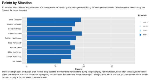
Top 10 goal scorers for the 2019-2020 season. Filtered to only show 5 on 5 points (both teams at full play).
3. Exploring Possession
Taylor most enjoyed exploring non-traditional statistics, like possession, to quantify a player’s value. His app made use of the Corsi metric, an advanced statistic which uses shot attempts as a proxy for possession time. Taylor looks forward to future explorations as the NHL moves more towards big data and analytics.
With the NHL launching player and puck tracking technology this season, I'm excited to dive into those numbers once/if they're made publicly available—that information is sure to add an additional dimension to how we view hockey from an analytic standpoint.
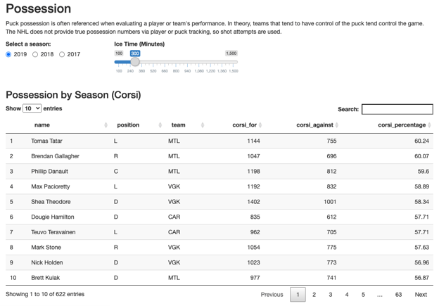
Top 10 Players by Possession/Corsi Percentage (Percentage of total shots by a player while he was on the ice.)
Explore the data for your favorite players and team in Taylor’s Shiny app. Let’s go Preds!