This series features mid-course projects for our Data Science Bootcamp. Students were first tasked with posing an interesting data question and finding a dataset to address that question. Next, they spent time cleaning, wrangling, and exploring the data, before designing and building an interactive Shiny app to display their findings and allow for further exploration.
As an art-lover, Data Science Cohort 4 student Savannah Sew-Hee was intrigued by the data that New York City’s Museum of Modern Art (MOMA) publishes on their artwork and artists. For her mid-course capstone project, she wanted to do an inventory analysis that would be useful for other companies, but use a data set that appealed to her personal interests.
By doing this inventory analysis, I can take what I have learned and made for this R shiny app and apply it to a company’s data set of their products in order to help a company visualize the products they have, [identify] discrepancies in their dataset, and suggest new unique products to add to their collection.
The Data Question
Using two CSV files she obtained using the Museum of Modern Art’s API, Savannah explored the data to discover how diverse their collection of artwork is, both in terms of nationality and gender of the artist and the category and medium of the art.
She initially had five things she was hoping to learn through her analysis.
- Find discrepancies in the data.
“For example, for a few artworks in the dataset, the date the piece was made is before the date the artist is born. The museum could then go back and investigate entries like these,” she explains. - Learn more about the diversity of the artists (nationality and gender) and the artwork (category and medium).
“This will be useful if the museum wants to put together similar pieces for a display (such as a display of Australian Art or a display of Paintings from the 1940s),” she shares. “This will also be useful so that the museum can decide which types of art to acquire so that they have a more diverse inventory.” - Look for patterns in when the artwork was acquired by decade. Did they acquire more of a particular category of art one decade versus another decade?
- Identify similar pieces of art.
- Provide an inventory summary for museum visitors and donors. “This [information] will enable them to effectively recruit new donors,” she states.
Cleaning The Data
With her questions identified, it was time to clean the data. Savannah quickly discovered her first challenge would come from the dates field. It’s not uncommon to find different formats when multiple people update a database, and the MOMA’s database was no exception. Savannah found multiple formats in the data field, including for example, Dec. 2, 1955, 1960-1962, and c. 1884. Her solution was to convert each date value into a single year, allowing for comparison across pieces. She was also curious about how old the artists were when their work was created, so she added a new column into the dataset in which she calculated the artists’ ages. She also added a geographic region variable based on the artist’s nationality.
Savannah used Python and the pandas library to clean the dates and reorganize the columns as well as for some preliminary exploratory analysis to see how well the resulting data could answer her questions.
Visualizing The Data
Savannah’s Shiny app, built with R with the help of the tidyverse library, features three dashboards, Artists, which explores the artists in the MOMA collection, Acquisition Over Time, which explores the mediums and categories/types of artwork acquired by decade, and a Text Analysis of the Collections Mediums.
((sunburst plot right aligned)) In the Artists dashboard, she created a sunburst plot with plotly to explore the country and region the artists are from. “The visual demonstrates which parts of the world the museum draws most heavily from (North America and Western Europe),” she shares.
A word cloud on the Acquisitions Over Time dashboard, visualizes the artworks’ mediums and was created using tm and wordcloud.
Finally, on the Text Analysis dashboard, “the scatter plot uses text mining to plot pieces of artwork near artwork with similar mediums,” Savannah explains. “This is useful for curators or art enthusiasts looking to acquire similar pieces of artwork by medium. They can use this feature of my app to identify similar pieces that they or their client might be interested in.”
The Results
Savannah noted several interesting results.
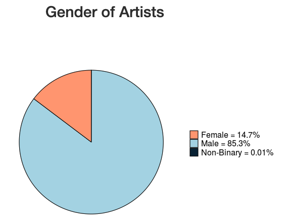
“I learned that the majority of the artists in MOMA come from countries with predominantly western cultures and 85% of artists are male. This aligns with the national average of artists in museums globally, and aligns with the demographic of artists whose artwork has been preserved over time.”
She also observed two findings with the scatter plot.
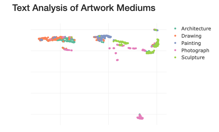
- Inspecting the scatter plot revealed that in some cases a few pieces from one medium had been included in a cluster of pieces from a different medium. When Savannah investigated, she found that in a lot of cases, these points were mixed-media pieces or collages. "This makes sense because it can be difficult to categorize these pieces. For example, an artist could create a piece of artwork by painting on top of a photograph. The museum could then classify this piece of art as either a painting or as a photograph,” she explains.
- The categories with the most overlap were Architecture and Drawing. “This makes sense because most architecture pieces in the museum are drawings of buildings,” she states.
Discover more of what Savannah learned by visiting her Shiny app.