This series features mid-course projects for our Data Science Bootcamp. Students were tasked with asking an interesting data question and finding a dataset to answer the question. Next, they spent time cleaning, wrangling, and exploring the data, before designing and building an interactive Shiny app.
Over the past couple of decades, sports teams have come to embrace data analytics, including the NBA. As a fan of basketball, Andrew Marsee has been intrigued by the use of analytics in team personnel decisions and in-game strategies and decided to do some analysis of his own for his mid-course project.
The Data Question
With his research, Andrew hoped to answer the following questions:
-
Does the number of days of rest before a game affect the outcome?
-
Do teams lose more often when they play on back to back days?
-
Are teams traveling from east to west at a disadvantage? What about the other direction?
His hypothesis was that “games on back to back days is tough on players, so the team with no rest is more likely to lose when playing a team with more rest.”
Cleaning The Data
Andrew used data from the Basketball Reference website through the ballr package in R. He shared, “To clean the data, I wrote a function to compile the schedule and results of every team since the 2014 season into one dataframe.” The data included the date of the game, start time, days between games, whether the game is played at home or away, and the final score. He then merged the data to display stats about both the home and away teams on the same row.
That’s where he ran into a challenge. “The data contained the abbreviation for the desired team, but the full name for the opponent,” he explained. “For example, the first 82 rows are the Atlanta Hawks because they are first alphabetically. So they show up in the data as 'ATL' but the opposing team had the full name, say the Indiana Pacers. I decided to add the abbreviation for the opposing team into the dataframe.” He also had to decide how to abbreviate teams that recently underwent a name change, like the New Orleans Pelicans.
Visualizing The Data
See Andrew’s Shiny app, NBA Scheduling Effect.
He split his visualizations into two pages to show different ways to parse the data. The first page shows the League Margin of Victory, meaning how the league as a whole performs. Users can pick the season, time zone, days of rest, and whether the game was at home or away to see how their team stacks up to the league. Andrew created the base visualization with ggplot2 and used ggplotly to convert it to a plotly object to make it the visualization more interactive.
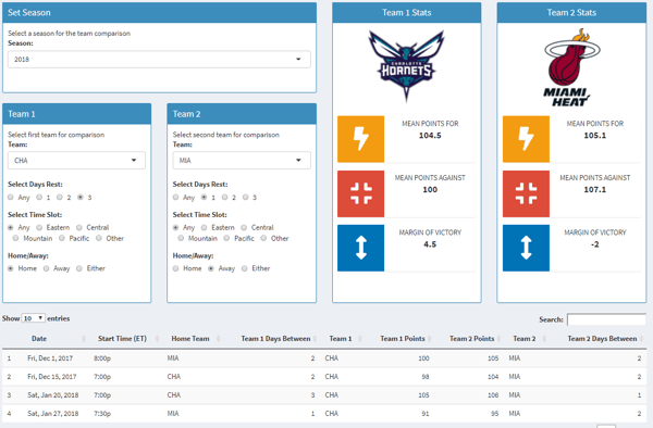
The second page is a Team Comparison. The user can select two teams to compare using the same parameters as the League Margin of Victory. Using this comparison tools, you can look at two teams scheduled to play soon and input the parameters for the two teams to predict the results of the upcoming game. He built this page using shiny components.
The Results
Andrew shared his findings.
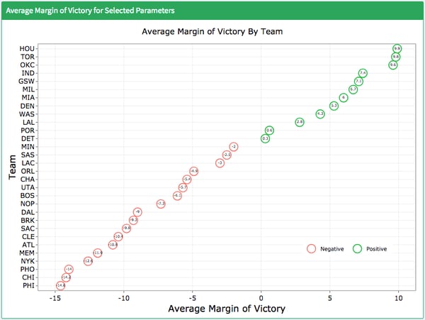
“I learned that the NBA teams performed worse on one day of rest across the league. I expected this and the data confirmed it.”
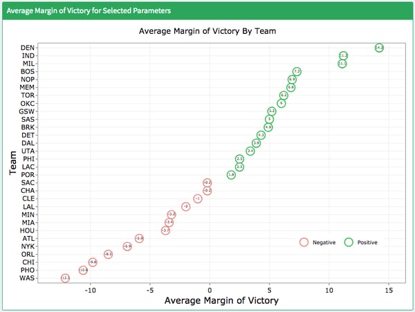
Average Margin of Victory by Team with 3 Days Rest (2019)
Average Margin of Victory by Team with 1 Day Rest (2019)
“I also learned that the games vary wildly on a night to night basis. I used the team comparison page to inspect individual games and there were situations where I would have expected one team to win, but it wasn’t the case. [For example,] the Heat were playing in Charlotte on January 20th. Charlotte had three days or rest and the Heat had one, but the Heat managed to win by one point. The data can be used broadly for season expectations but isn’t so reliable on an individual game basis.”