This series features mid-course projects for our inaugural Data Science Bootcamp. Students were tasked with asking an interesting data question, finding a dataset to answer the data question, cleaning, wrangling, and exploring the data, then designing and building an interactive Shiny app.
Summer is here, so it seems like a good time to talk about America’s favorite summer pastime...baseball. Evan Lancaster, a fan of the Chicago Cubs and Anthony Rizzo, wanted to analyze the pitches thrown to one of baseball’s greatest hitter (Rizzo) to see if he could design a model to help managers and pitchers answer the question of how to pitch to the best hitters in baseball.
Evan explained all that can go into a pitching decision, “Should a pitcher throw his best stuff and challenge the hitter, or should he stay away from the strike zone and try to fool him into swinging at bad pitches, or should he just intentionally walk him and focus on getting the next batter out? It often depends on the game situation. Is it a tie ballgame? Are there runners on base? How late in the game is it? How well has the pitcher been doing up to this point in the game? And even within a particular plate appearance, how many balls and strikes are there? Those questions, along with about a dozen others, run through a manager’s head as he plans his pitcher’s next move, but ultimately, that decision will come down to a manager’s and/or pitcher’s gut feeling.”
The Data Question
With his research, Evan hoped to answer the following questions:
- Are there scenarios that should worry pitchers more than others when facing Rizzo?
- If so, what are effective strategies for handling those scenarios?
- When is Rizzo likely to do the most damage in a game?
His initial hypotheses were...
- Rizzo has gotten pretty tough to face with two strikes over the last couple of years since he adopted the old-school choke-up grip on the bat to gain more control of his swing in an attempt to make better contact with curves and sliders.
- Inside pitches are less effective against Rizzo than other batters, because of how close he stands to the plate, tricking umpires into calling would-be strikes on the inside corner of the plate as balls, and also getting hit by pitches that would miss other batters.
- The more pitches Rizzo can see in a plate appearance, the more dangerous he becomes.
- The more times Rizzo sees a pitcher in a game, the more dangerous he becomes against him.
- Rizzo is more susceptible to a curve breaking toward him than to other pitches.
Cleaning The Data
To explore his questions, Evan used data from baseballsavant.com. He used readr to read the csv file and plyr to map values to their coded IDs. He used several tidyverse subpackages to filter and mutate values and columns.
While the cleaning process was uncomplicated, to get the results and visualizations he wanted, Evan had a lot of work to do.
Wrangling the data was rather involved, because of all the mathematical hoops I had to jump through to get the data in a form that would be suitable for the visualizations and summaries I was trying to convey.
For instance, I was trying to examine the statistic of ‘barreling’ the baseball (which correlates launch angle and exit velocity off the bat with batting average and slugging percentage), but that wasn't in the data (or so I thought at the time...).
The only things I had to work with were the raw launch angles and exit velocities. So, first, I converted the launch angle using a normal probability density function that came close to mimicking the range of angles included in the actual barrel statistic.
Next, I converted the exit velocity using a cumulative distribution function that somewhat resembled the exit velocity component of the current barrel statistic. Finally, I multiplied those together and put a ceiling of 1 on the result to come up with a number that closely resembled the actual barrel statistic.
In fact, in some ways, it is actually an improvement upon the current stat, because it is not just a binary outcome (barreled or not barreled) like the current stat is. Hitters actually get partial credit for contact that falls just outside the ‘barrel zone'.
Visualizing The Data
Evan had some unique ideas for visualizing his data.
I wanted to get as complete a picture as possible of the data, from the location of each pitch in relation to the strike zone, to how the ball left the bat, to where it landed in the field. Once I made that decision, the choices for the three scatter visualizations were a no-brainer.
Implementing them, however, proved more challenging than I had anticipated. I used ggplot to create them initially, but then I piped them into a ggplotly wrapper function to get the interactivity of the tooltips.
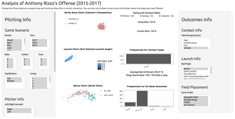
Explore his Shiny app, Analysis of Anthony Rizzo's Offense (2015-2017).
The Results
When Rizzo has two strikes against him, he swings at over two-thirds of the pitches. When he does make contact with the ball, he is half as likely to squarely-hit the ball versus when he has fewer than two strikes.
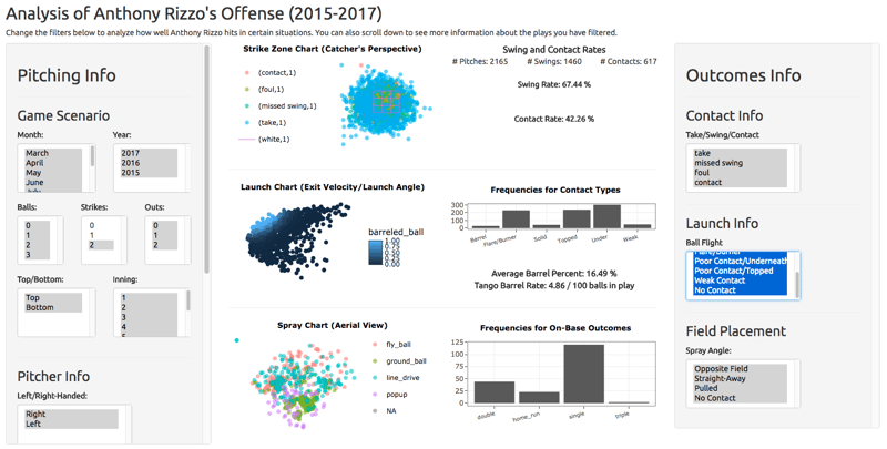
Most of Rizzo’s home runs come from pitches to the outer and lower half of the plate. Since he crowds the plate more than other hitters, he can connect the ball to the barrel of the bat in that section of the strike zone with power.