This series features mid-course projects for our inaugural Data Science bootcamp. Students were tasked with asking an interesting data question, finding a data set to answer the data question, cleaning, wrangling, and exploring the data, then design and build an interactive Shiny app.
Thanks to Xander Morrison and Gotee Records for allowing us to share about the project Xander built for internal use at Gotee Records.
Independent record labels have a lot of data at their disposal, but they don’t always have an easy way to gain insights from that data. Xander Morrison joined our Data Science bootcamp to create tools that allow the team at Gotee Records to gain insights about how their music is being consumed.
When it came time for his mid-course capstone, Xander was ready to start showing Gotee Records some insights. He shared, “my primary motivation is to present my company with valuable intelligence that can be used in marketing campaigns tailored to each of our artists. The goal is to notice differences in how each artist’s music is streamed so that we can lean into those strategies as we continue to create and publish music.”
The Data Question
Xander’s initial questions included:
- In what context are our artists being streamed (i.e. playlists, libraries, radio)?
- Which artist is being streamed the most frequently?
- Are certain customers streaming a song multiple times?
- Which zip codes are the hottest markets for our artists?
He expected to find a couple results.
- Younger artists will have a higher streaming play count
- Most songs will be listened to on a playlist
For this project, he was able to use Apple’s iTunes API which includes streaming data from Apple Music. Xander narrowed his data down to songs streamed in the United States during September 2017 so that he could work with a manageable data set. After downloading the data, he shared what he saw, “each row was an instance of a stream of one of our songs; however, the only identifiable information in this original data set was the Apple ID for that song. There was no artist name, no song title, no album name.”
He was able to pair this data up with another data set that mapped Apple IDs to song title and artist name. To gain insights into hot markets, he paired the zip code data from Apple with a dataset that maps zip codes to latitude and longitude coordinates and then mapped that to a dataset with cities and states.
He used plyr, dplyr, and tidyverse to manipulate the data. He used magrittr to create pipelines for passing data around to different functions.
The Visualizations
Xander’s goal for this project was to create a “fast aggregator and visualizer” for information that can drive decisions at the record label. Artist managers and marketers at the label want easy-to-use tools where they can find answers quickly to inform their decisions. To achieve this, he made sure his visualizations were clean and understandable. He utilized ggplot2 to create line charts and bar graphs. He used a map of the United States to show where songs were being played.
The Results
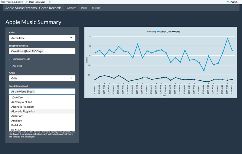
A song by song comparison of stream counts.

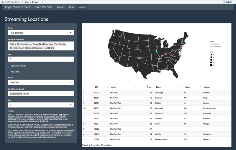
Hot market comparison for two artist.

Xander will be building upon this project for his final capstone which he hopes to deploy for internal use at Gotee Records.


