This series features mid-course projects for our inaugural Data Science bootcamp. Students were tasked with asking an interesting data question, finding a dataset to answer the data question, cleaning, wrangling, and exploring the data, then design and build an interactive Shiny app.
Miscommunication and misinterpretation can impact science news as it moves from the lab to the public. This miscommunication could be due to poor communication style, technical nuance, or sensationalized media headlines. Mahesh Rao was curious to dig into how the science community could better communicate and shared an example of misperception that happened regarding the relationship between autism and vaccines. An article published in 1998 in The Lancet, a medical journal, claimed a link between the MMR vaccine and an increased risk of autism. The story spread like wildfire in the media. Despite immediate scrutiny and the article being retracted and disputed by additional studies, there is still a belief among some that the MMR vaccine increases the risk of autism. As the barrier between scientific research and the public lessens, due to things like social media, more communications misfires are likely to occur.
The Data Question
So what can be done to improve communication of science news to the public? Mahesh believes the first step is to analyze the dynamics of the current communication to develop better strategies for improvement. It’s a big undertaking, so Mahesh decided to focus on the communication that happens through Twitter.
He broke his process down into three steps.
1. Gather Twitter data from a select group of users that publish and share scientific stories.
Mahesh carefully selected journals with high impact scores (based on how often they are cited) and news outlets based on their score for scientifically accurate reporting. He followed these accounts on Twitter.
- Science journals, like Nature, Science, and Cell
- Medical journals, like New England Journal of Medicine, Journal of the American Medical Association, The Lancet
- News organizations, like NPR Science Desk, New York Times Science Times, BBC Science News, National Geographic, Scientific American, Wired
- Notable individuals in the scientific community: Neil DeGrasse Tyson, Hans Rosling, Ben Goldacre
- NASA: conducts and shares scientific information
To gather the data, he created a Twitter search tool to locate tweets from specific users with the twitteR package. He also created a listener to gather information like the number of followers to an account using streamR package. The data was fairly clean, but he did have to remove links, emojis, digits, and usernames. Additionally, he changed all of the words to lowercase and removed stopwords -- articles and conjunctions, like “the,” “but,” “and,” etc. He used the R package tm and functions from base R and dplyr to clean the text.
2. Determine the popularity of the tweet based on the number of retweets and favorites.
Mahesh explained his rationale, “more popular stories will be shared and marked as favorite more often than unpopular stories.”
3. Perform NLP, natural language processing, to determine the most commonly used words or phrases for the popular and unpopular stories.
He conducted additional sentiment analysis to find differences between the two groups.
The Visuals
When deciding on his visualizations, Mahesh wanted to help identify some factors in the text of tweets that made them popular or unpopular.
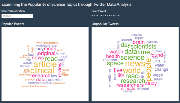
He used the wordcloud package to create a wordcloud to show the most frequent words in a group.
With tidytext and ggplot2 he created a bar chart to show sentiment analysis to see if certain sentiment-associated words or overall sentiment was more common in one group.
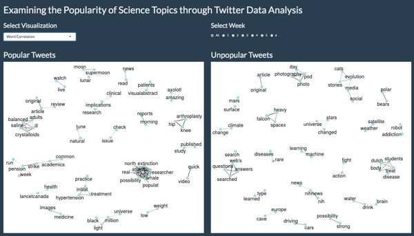
A word correlation graph, created with widyr, igraph, and ggraph, gives more context for each word in a sentence and helped identify if certain groups of words or overall trends in topics were different between the two groups. Users can also see how trends changed or stayed the same.
The Results
You can see Mahesh’s visualizations and results on Examining the Popularity of Science Topic Through Twitter Analysis in his Shiny app. While he did not do any direct analysis, Mahesh noticed that the popular tweets were generally about clinical topics and had a (slightly) negative sentiment.
He also learned that collecting more tweets is necessary for identifying longer trends. He shared, “the first batch of tweets were around the time the Falcon Heavy rocket launched and the super blood moon happened. Those were clearly popular topics. After I had collected all my tweets and re-ran the analysis, neither of them were the most frequent topic and Falcon Heavy had moved into the unpopular category.”
Mahesh shared another drawback to his research, “Twitter text data is both too short and too variable. Since tweets are typically short, finding correlations between words can be hard since there are so few word combinations in a single tweet.” He grouped the popular and unpopular tweets together, but thinks it would be best to normalize the strength of the correlation by the total number of word pairs in a tweet.
Finally, Mahesh explained, “I haven't been able to capture this in my analysis yet but language is (obviously) very nuanced and picking out individual words or groups of words is far from being able to identify popular topics. The trends I observed here are good starting points for further investigation.”
While more analysis needs to be done in order to make recommendations about ways to prevent miscommunication, Mahesh gained valuable insights into analyzing short Twitter communications.