This series features mid-course projects for our Data Science Bootcamp. Students were first tasked with posing an interesting data question and finding a dataset to address that question. Next, they spent time cleaning, wrangling, and exploring the data, before designing and building an interactive Shiny app to display their findings and allow for further exploration.
The Phillips curve is a widely accepted economic theory developed by William Phillipswidely, which suggests that inflation and unemployment have a stable and inverse relationship, meaning that with economic growth comes inflation, which in turn should lead to more jobs and less unemployment. With a background in finance, Jeffrey Reeve of Data Science Cohort 6 at Nashville Software School (NSS) took it upon himself to analyze this economic theory with his mid-course capstone project.
The Data Question
Though the Phillips Curve theory originally examined the relationship between unemployment and inflation in the labor market, Jeffrey explains that it was later extended to the broader economy and became accepted as fact. Therefore, Jeffrey posed the data question, "Does the inverse relationship between unemployment and inflation in traditional Phillips Curve theory hold true in an examination of the broader economy?"
Jeffrey shares that he chose this topic because he is a self-proclaimed “economics nerd”. “There has been a huge amount of debate on this subject over the years and I wanted to see what the data showed and if the theory was actually accurate.”
Gathering & Cleaning The Data
Fortunately for Jeffrey, there are a lot of good economic data sets available so the data wrangling & cleaning was pretty straight forward. “I did have to merge together multiple data sets and make sure the dates meshed together uniformly,” he explains. Jeffrey used dplyr and tidyverse to gather and clean his data.
Analyzing The Data
Using two different visualizations to analyze the relationship between unemployment and inflation, Jeffrey analyzed if the Phillips Curve Theory (inverse relationship) was true or not. “On a scatter plot of unemployment vs. inflation, the regression line should be downward sloping so it's easy to see if the theory holds true,” he shares. “On a line chart over time with unemployment & inflation on the y-axis, the lines should be moving in opposite directions so it's also easy to see if the theory holds true.”
Visualizing The Data
Jeffrey’s Shiny App
Using his scatter plots with regression lines and line charts over time for his visualizations as these are most commonly used in economic analysis. “I was trying to display the data in an easily understandable format and accentuate any patterns that arise from it,” he explains. Jeffery created his visualizations using ggplot from tidyverse.
The Results
Though the Phillips Curve has long been accepted as fact in economics, Jeffrey found it interesting to see that, through his analysis, the theory does not hold true over the long term. “The traditional downward sloping Phillips Curve (relationship between unemployment and inflation) is, in fact, now flat or horizontal.”
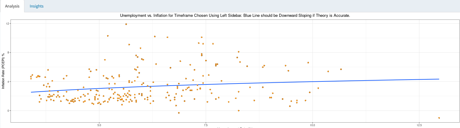
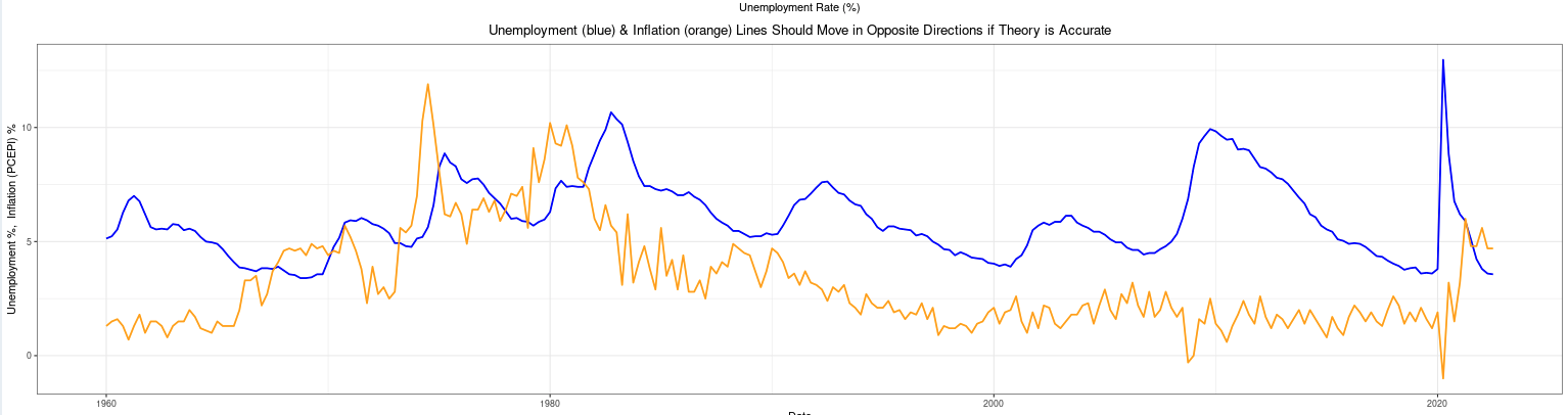
Jeffrey goes on to explain that since 1983, the Federal Open Market Committee (FOMC), which sets interest rates in the U.S., has successfully targeted low inflation, producing a strikingly flat Phillips Curve over the 40-year period. “Finally, it's notable that since 1960, the Phillips Curve Theory does actually seem to hold true during most economic recessions.”
Interested in learning how to clean and present data for yourself? Check out all our Data Science Bootcamp has to offer you in data exploration! Visit our program page to learn more and apply.