This series features mid-course projects for our Data Science Bootcamp. Students were first tasked with posing an interesting data question and finding a dataset to address that question. Next, they spent time cleaning, wrangling, and exploring the data, before designing and building an interactive Shiny app to display their findings and allow for further exploration.
Have you ever wondered what the Motion Picture Association of America (MPAA) rating reasons, or descriptors, might reveal about the content of movies themselves? Monica Weiss-Sharp has! In this blog post, we'll take a closer look at what she discovered about the language of MPAA rating descriptors through her midcourse capstone project in NSS’s Data Science Cohort 6!
The Data Question
“You had me at ‘macabre and suggestive humor’,” Monica laughs at this odd reason for the rating given by the MPAA for the 2019 animated version of The Addams Family. Monica came across an unusual list of reasons used to justify MPAA ratings assigned to movies while searching for a data set to explore for her midcourse capstone project. “This piqued my curiosity,” she explains.
Monica decided to perform a text analysis to determine if there were trends in MPAA movie rating reasons, do the descriptors reveal anything about the context in which they are rated, did content concerns change over time, is there a language similar or distinctive between different ratings, what are the modifying words and phrases connected to frequently occurring the ratings, and are there associations among words such that they often appear in the same ratings together? “This is my first time performing text analysis and part of my motivation is the opportunity to learn more about tools and methods for effectively uncovering the insights held within text-based information,” she expressed with excitement.
Cleaning The Data
Monica started her data cleaning process by scraping the data she gathered from filmratings.com with Python, using Selenium as a web driver combined with the requests package.
Although equipped with the tools and skills to clean the data proficiently, she ran into some challenges along the way, namely with identifying which movies were re-releases, either to home video or older movies having a new run in theaters. “I wanted to focus on original releases from the time that movie rating reasons came on the scene to the present,” she explains. “There were, of course, some issues to address with incorrectly spelled words in the rating reasons, as well as how to deal with compound words in my text analysis, but those weren't too bad to tackle,” she smiles.
To clean her data and text analysis, Monica used the tidyverse, tidytext, and tm packages.
Visualizing The Data
Monica’s Shiny App
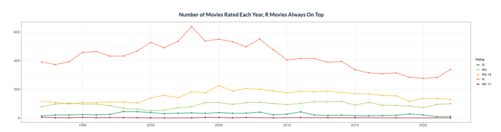
Once the data and text analysis was cleaned, it was ready to build out the visualizations, which she created using ggplot2. Since the data spanned a time period of just over 30 years, Monica used line graphs to show trends over that time frame. She shares how important using a variety of visualizations was to her for both visual interest and also audience engagement in order to tell the different stories within her data. For data about specific words or phrases used in the movie rating reasons, Monica used bar and lollipop graphs to easily make distinctions in frequency of use.
“I also found two very cool word cloud options in the wordcloud package,” she shares. “One shows words that two sets of text have in common, with bigger words indicating a stronger degree of commonality, and the other does a comparison and visually represents which words were more likely to come from one set or the other.”
Monica also made use of Shiny's reactive text output in boxes at the top of her dashboards to highlight key values from the data, based on any filters the user selects.
The Results
After completing her project, Monica shares that she was most surprised to learn that R rated movies make up the majority of movies in the time period she analyzed. “I had expected PG-13 to be close, if not even a bit higher,” she notes.
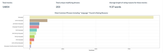
She discovered that issues related to the language used in movies is the most frequent concern noted in the descriptors for all ratings except NC-17. “This actually makes a lot of sense, but it wasn't what I was expecting coming into the analysis. Words like "some" or "strong" are the most common modifiers for the major areas of content concern, and the modifiers for concerns related to the action in a movie are the most fun to explore.” she says. “Go to the "Modifiers & Associates" tab of my app and select "action" [in the drop down filter] to see what I mean!”
More broadly, Monica shares that through completing this project, she discovered that she really enjoys working with text. “ It was great to learn some new tools and techniques, and also to satisfy my curiosity about what there was to discover in the language used to explain the reasons behind movie ratings.”
For more insights from Monica’s, visit her Shiny app or her project on GitHub.
Interested in learning how to clean and present data for yourself? Check out all that our Data Science Bootcamp has to offer you in data exploration! Visit our program page to learn more and apply.