This series features mid-course projects for our Data Science Bootcamp. Students were first tasked with posing an interesting data question and finding a dataset to address that question. Next, they spent time cleaning, wrangling, and exploring the data, before designing and building an interactive Shiny app to display their findings and allow for further exploration.
It’s no surprise that Nashville’s rapid growth in population over the past decade has led to higher volume of traffic on Davidson County roadways, as well as a spike in traffic accidents each year. Rohit Venkat of Data Science Cohort 5 wanted to better understand these traffic accident patterns through his mid-course capstone project, using visualizations to highlight areas for potential improvements in roadway design, bicycle and pedestrian corridors, and traffic signs.
The Data Question
Rohit set out to ask questions such as “Which Nashville roadways have the highest traffic accident risk,” and “Which environmental factors are most associated with traffic accidents?” He also compared accident types and characteristics by type of road. Finally, Rohit looked for trends in traffic and accident volume since 2014."
Cleaning The Data
In order to begin answering these questions, Rohit dove into the data from his two primary data sources: traffic accidents reported to the Metro Nashville Police Department (MNPD) and Davidson County road centerline geometries provided by the Tennessee Department of Transportation (TDOT). “The data cleaning process was unremarkably straightforward, [which is] a testament to the quality of these datasets maintained by MNPD and TDOT,” he says. Rohit began by filtering out the few traffic accidents without valid geospatial coordinates, such as traffic accidents that map to the Atlantic Ocean. He then mapped the remaining 234,640 traffic accidents to the nearest Davidson County road segment. Finally, he summarized traffic accident statistics by roadway.
Rohit shares that he performed most of his data pre-processing using R’s Tidyverse packages along with the sf package for performing geospatial data manipulations (e.g. mapping traffic accidents to roads).
Visualizing The Data
Since his project centered around geospatial analytics, Rohit wanted to create an immersive map that would organize and convey data insights as the focal point. “The entire app is a full-screen map with no navigation options that take you away from the map itself,” he explains. “Instead, I built features on top of the map, including a sidebar for selecting map inputs for visualization and buttons that offer additional functionality through modal windows.”
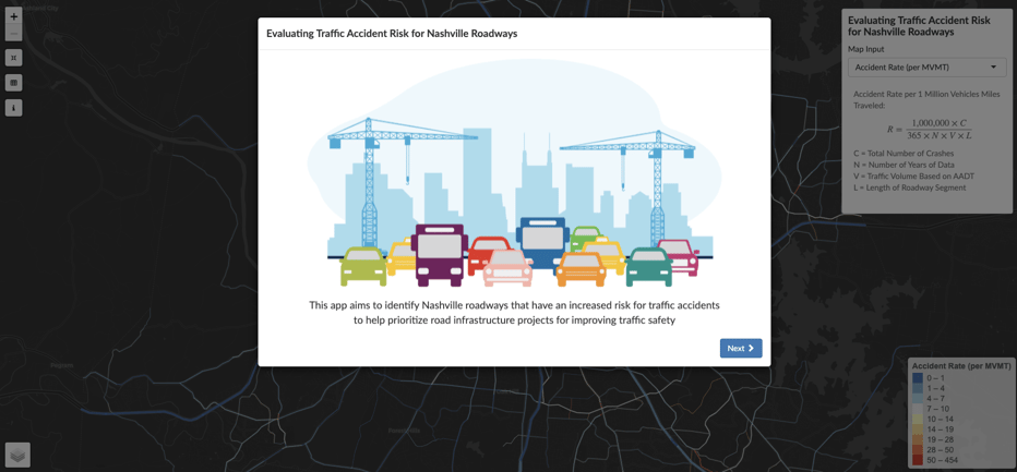
Keeping his user’s experience with his app in mind, Rohit built in a pop-up window that appears when you first open the application which explains every data visualization you’ll interact with in the app.
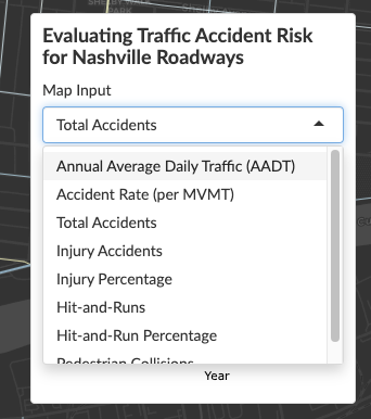
With the sidebar dropdown menu, users can visualize road segments based on statistics such as annual average daily traffic, accident rate, total accidents, injury accidents, hit-and-runs, and pedestrian collisions.

Hovering over an individual road segment with your mouse also provides a breakdown of each statistic for that road segment. Rohit created the barplots visualizing yearly trends using the ggplot and plotly packages and the map visualizations using leaflet.
The Results
Rohit points out two things he learned after gathering and analyzing the data:
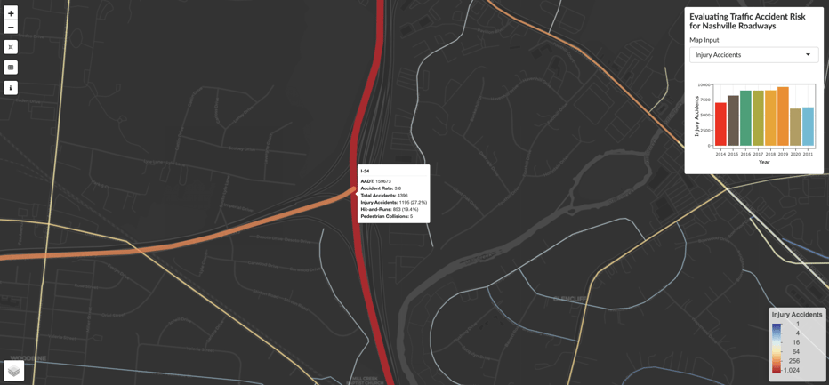
This map shows the high volume of injury accidents at the I-24/I-440 junction.
- Interstates and arterial roads typically have low accident rates due to being designed to handle large traffic volumes. However, the data show that several major arteries of Nashville, including Gallatin Pike, Nolensville Pike, Dickerson Pike, and Murfreesboro Pike, have less than ideal accident rates and a high percentage of traffic accidents resulting in injury. These roads pose a disproportionate risk to pedestrians as well.
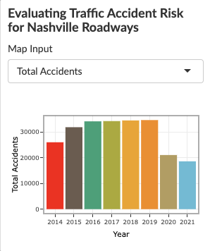
- When looking at yearly trends, the total number of traffic accidents has dropped precipitously since the start of the pandemic—a consequence of the 2020 lockdowns and more people working from home.
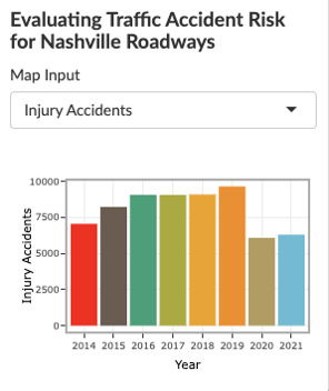
Despite fewer cars on the road, however, the percentage of traffic accidents resulting in injury rose from 27.9% in 2019 to 33.9% in 2021. “This might be possibly due to drivers engaging in riskier behavior, including speeding, failing to wear seat belts, and driving under the influence of drugs or alcohol,” Rohit shares.
Learn more about Rohit’s project when you visit his GitHub Repo.