This series features mid-course projects for our Data Science Bootcamp. Students were first tasked with posing an interesting data question and finding a dataset to address that question. Next, they spent time cleaning, wrangling, and exploring the data, before designing and building an interactive Shiny app to display their findings and allow for further exploration.
With triathlon participants hailing from diverse backgrounds and varying ages, including Data Science Cohort 5 student Conrad Reihsmann, there’s a lot of data to study from the sport! “As someone who has recently picked up the sport, gaining insight into what methods are effective could help better focus my personal training and better familiarize myself with [triathlon]” he shares. “It also provides a rich source of data and multiple avenues to explore.”
The Data Question
With his mid-course capstone project, Conrad explores the question of whether specialty or strength in one triathlon sport over another correlates with higher placement overall. Additionally, he wanted to investigate what age groups tend to be most competitive and if these trends are consistent across gender.
Cleaning The Data
The first step was gathering the data, which Conrad retrieved from World Triathlon, the international governing body for the sport of Triathlon. Conrad made use of the Triathlon.org API Platform, which allows access to the entire Triathlon.org infrastructure and data. The platform consists of several distinct APIs which cover a variety of use-cases. Conrad used R to make the API calls to the Results API, first gathering unique program and event IDs for events that occurred between 2009 and 2019. Next, he made additional API calls using these event IDs to retrieve more detailed information on each event, getting the results for all competitors and event-specific information like location and temperature, when available.
Next came formatting the data, which Conrad shares, proved to be one of the most challenging hurdles, as most of the questions he posed were based on overall times (hh:mm:ss).
“There were also a fair amount of events that were mislabeled in the API call where Olympic races were labeled as ‘sprint distances’ and vice versa,” he explains. “Along with those problems, there were several instances of race distances being altered due to weather which needed to be located and then excluded from the dataset.” Conrad used the tidyverse collection of R packages to prepare his data, including the lubridate library to handle working with times.
Visualizing The Data
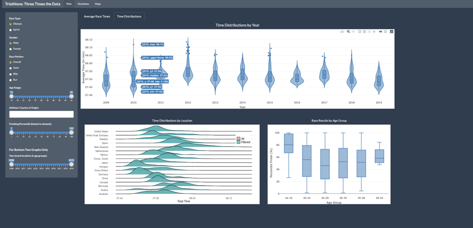
Next came deciding how to best present his data in his Shiny app. “I chose the density, violin, and ridgeline plots for time because they helped to show the distribution and range of times in the sport, which I felt was important since there was no effective way to normalize for course location and routes,” he says of the application’s visualizations.
For the results by age group, Conrad chose a simple box plot in order to display both the overall trend and how it can vary greatly within each group.
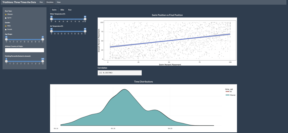
To compare the different disciplines to the overall triathlon (swimming is pictured above), Conrad chose the scatterplot with a regression line for its effectiveness of showing correlation. He plotted each competitor's finishing position per discipline compared to their overall finishing position for the whole race. Interestingly, for swimming and biking, the correlation between these events and overall finishing position was relatively low, and it was not uncommon for a competitor to be close to the bottom of the field in that event but still finish the overall race towards the front of the pack. However, the correlation proved to be much stronger for running.
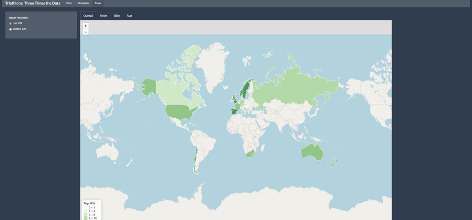
Finally, Conrad used a choropleth map to highlight countries where a large percentage of competitors performed well either overall or by event. The map allows users to interact with the provided visual representation of the data and give additional clarifying information through a hovering feature.
Conrad used ggplot2, Plotly, and Leaflet to create the visualizations in his application.
The Results
Conrad’s data found that in the sport of triathlon, trends over time (years) were mainly determined by race location and course and that age was not a large determining factor of success. He was also surprised to discover that the success on the run portion has the highest correlation with overall success across race types (Olympic and sprint) and gender.
Learn more about Conrad’s project when you visit his GitHub Repo.