This series features mid-course projects for our Data Science Bootcamp. Students were first tasked with posing an interesting data question and finding a dataset to address that question. Next, they spent time cleaning, wrangling, and exploring the data, before designing and building an interactive Shiny app to display their findings and allow for further exploration.
Neda Taherkhani of Data Science Cohort 5 was motivated by her work as a linguist for her mid-course capstone project. She wanted to expand on her previous work which mainly focused on the endangered language of Southern Tati, spoken in the northwestern parts of Iran, to analyze data from other endangered languages.
The Data Question
For her project, Neda first asked how her data could be presented to facilitate exploration of and understanding the overall landscape of endangered languages around the world. She wanted to create a way to easily see where endangered languages are located and what the degree of endangerment looks like per country or region. Next, Neda brought in additional data on the countries of the world, including GDP per capita, spending on education, and other factors, to search for any associations between these measures and the proportion or number of endangered languages in a given country.
Cleaning The Data
The main dataset Neda worked with came from a 2011 Datablog article published by The Guardian and used data from the United Nations Education, Scientific and Cultural Organization (UNESCO). The dataset contained 14 variables in total, including the name of language, longitude, latitude, the number of speakers, and a degree of endangerment assigned by UNESCO. The degree of endangerment places each language in one of five categories (vulnerable, definitely vulnerable, severely vulnerable, critically endangered, or extinct) indicating how close it is to extinction.
Additional datasets Neda used were downloaded from UNdata, a site hosting a large number of resources compiled by the United Nations (UN) statistical system. “The datasets are listed on the website as: International migrants and refugees, GDP and GDP per capita, Education at the primary, secondary and tertiary levels, Public expenditure on education, Health expenditure, Gross domestic expenditure on R & D, Land, CO2 emissions estimates, Threatened species, Internet usage, and Tourist/visitor arrivals and tourism expenditure,” she states.
Neda then filtered these datasets to isolate data for the year 2011. If a language did not have data for 2011, she used the nearest year available so that the results would be comparable with the language data from 2011.
Her final data source came from Ethnologue, which provides a list of the countries and the languages spoken in each.
The counts of the languages per country were put into the dataset. “I applied several modifications to this dataset due to the mismatches between the names of the countries in this dataset and my original language dataset,” she says. “One drawback of using this dataset is that the data is updated; so the number of total languages in each country reflects their current status. Plus, depending on the definition of "language" these numbers can be misleading. Still, I used the data for my app, as the dataset served my purposes of learning!”
Neda then merged the three sources of data to make her final dataset.
Visualizing The Data
Neda’s Shiny app on RStudio shows the distribution of endangered languages in the world and how a country's economic variables may correlate with its ratio of endangered languages.
“The app has two tabs: Language Map, shows the distribution of the endangered languages in the world. Each dot on the map represents an endangered language. The size of the dots is proportional to the number of their speakers. The level of the endangerment of the languages is distinguished based on their color: Khaki for Vulnerable languages, Yellow for Definitely Endangered ones, Orange for Severely Endangered languages, Red for Critically Endangered ones, and Black for Extinct languages. The vitality/endangerment degree of the languages has been mainly distinguished based on intergenerational transmission [from] these definitions provided by unesco.org:
- Vulnerable: most children speak the language, but it may be restricted to certain domains (e.g., home)
- Definitely endangered: children no longer learn the language as mother tongue in the home
- Severely endangered: language is spoken by grandparents and older generations; while the parent generation may understand it, they do not speak it to children or among themselves
- Critically endangered: the youngest speakers are grandparents and older, and they speak the language partially and infrequently
- Extinct: there are no speakers left"
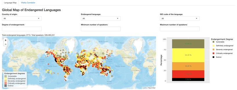
The selection boxes in the app allow users to look up endangered languages based on their level of endangerment, country, name in English, ISO code, and minimum/maximum number of speakers.
Each selection or combination of selections shows the number of the languages selected and the total number of speakers. The "Endangerment Degree" box makes it possible for the users to choose more than one level of endangerment. The interactivity of the tabs can be improved in future updates such that certain selections automatically interact with other tabs. The bar chart on the right side of the map is interactive with the choice of country at the present time. As the country is selected, this bar chart updates such that it shows the endangered language composition of the country.
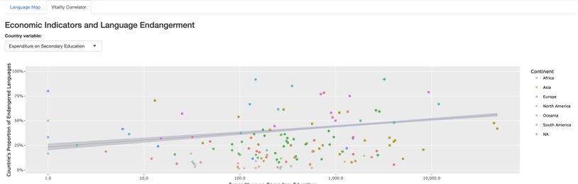
The "Vitality Correlation" tab in the app shows the relationship between a country's economic variable such as Expenditure on Secondary Education (shown above), with the ratio of endangered languages per country.
“While some of the variables did not show a strong correlation between the country variables and the endangerment ratio, some of them show a rather strong relationship: The countries with a higher rate of expenditure on secondary education are associated with a higher rate of endangered languages. Among the highest is the US,” she explains. “This was against my expectations. However, it can be explained in terms of the standardized education that the investing countries may have: Education can be limited to a specific language or class within countries. However, caution needs to be taken when interpreting these relationships such that correlation is not translated into causation.”
The Results
“One of the first things I noticed on the map is the number of extinct languages in the western parts of the United States. While it is sad to see all those beautiful languages/cultures be extinct now, it is great to see that some of the communities speaking native American languages are active in documenting, revitalizing and transmitting their languages to the children,” she shares.
“In my culture, black is the color of mourning and seeing all these black dots on the map created a feeling of sadness and mourning in me, as a person and a linguist. All of these languages, in the state of emergency, are interwoven into a rich culture, ideologies, and values systems. It is true that most of them have lost their functionality in modern life. However, letting any of these languages die means letting the otherwise invaluable treasure of culture and values go with them.”
I believe it is our responsibility to get to know these languages and put our resources together to at least document them. These languages have not emerged all at once. There has been thousands of years of investment in each of them. It is not fair to let them go in one generation.
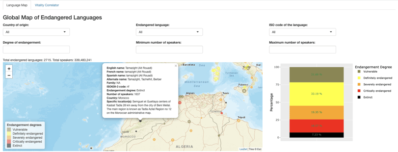
When reviewing the results, Neda noticed some discrepancies in the data. “For instance, I noticed that the dot related to Tamazight (Ait Rouadi) is bigger in size compared to other extinct languages’,” Neda shares about her analysis of the data. As she began to take a closer look at the data related to this language, it showed that, although labeled as extinct, meaning no native speakers, this language in fact had 1637 speakers. This discrepancy led her to look at the accuracy of data in later stages of building out the app.
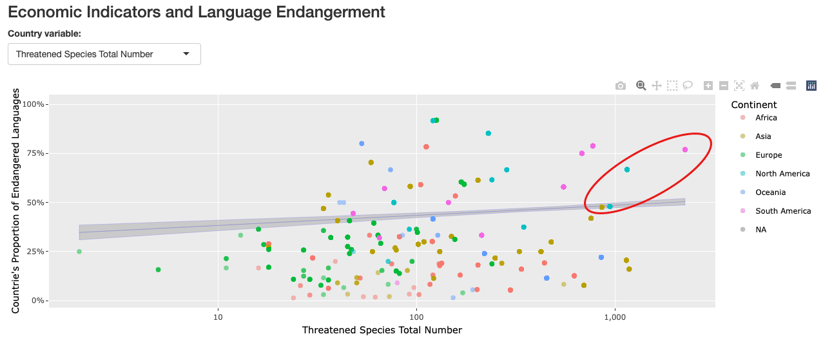
As far as the relationship between country economic variables and language endangerment level, Neda shares that she found it interesting to see where some of the countries with the highest proportion of endangered languages stand with regard to their endangered species. “Examples are Ecuador, Mexico, China, and the United States showing a high proportion of endangered languages and a high number for endangered species,” she explains. “However, caution needs to be applied in interpreting these data: the size, biological/geographical specifications, and several other factors needed to be considered for comparing countries with this regard.”
For more insights from Neda, visit her Shiny app or her project on GitHub.