The December Data Viz Competition landed squarely in the middle of capstones for our data analytics students and mid-course projects for our data science students, but the entries did not disappoint! The datasets this time -- crop yield by country 1961-2018 and a geojson file with polygons for the countries -- inspired some interesting perspectives.
Data Science Cohort 3 graduate Anamika Sharma wins an honorable mention for December with this animated map using plotly. The winner is Heather Sopel, a graduate of Full-time Data Analytics Cohort 2. Heather’s Tableau story is clean, simple, and effective in showing how crop yields have shifted over time.
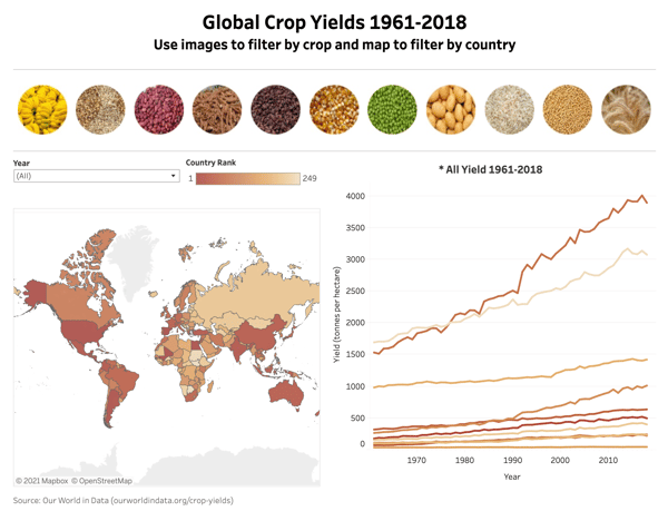
With Heather’s second win in a row, we instituted the ‘Heather Rule.’ Students and Seekers are now limited to a total of 3 wins. January’s data presents Black Americans in Congress. We’re looking forward to celebrating Black History Month with our students’ work.