Data generated from the COVID-19 pandemic has captured our collective attention for most of this year, and in November two of our classes – Data Science Cohort 4 (DS4) and Data Analytics Cohort 3 (DA3) – worked on separate projects to answer several pandemic related questions. The data for these projects can be found on Nashville’s Open Data portal, at this NYT GitHub repository, in tables scraped from WSMV’s website, and in a dataset that was provided on request by Metro Nashville Chief Epidemiologist Rand Carpenter.
DATA SCIENCE COHORT 4
How do reported Safer at Home violations align with coronavirus cases?
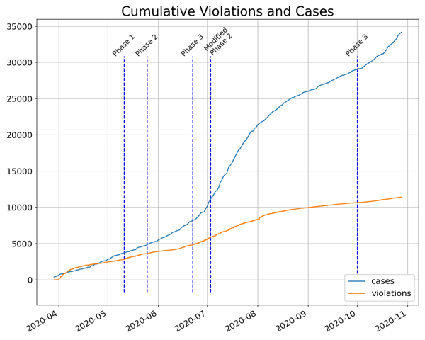
In order to combat the spread of COVID-19, the Metro Public Health Department issued a Safer at Home order which went into effect March 23. hubNashville accepts reports of potential violations of this order, which are then investigated by Nashville Public Health. Students in DS4 investigated the timeline of cases and reported violations starting in late March along with Metro’s reopening timeline. In response to the coronavirus, Metro Nashville announced a 4-phase reopening plan which began May 11. Nashville initially moved into Phase 3 of reopening on June 22 before reverting to a modified Phase 2 on July 3 after a surge in new cases which continued through September. On the hubNashville side, reported violations showed a similar surge in the month of July. After entering Phase 3 of reopening for a second time on October 1, the rate of new cases again picked up, while the number of violations did not see such an uptick.
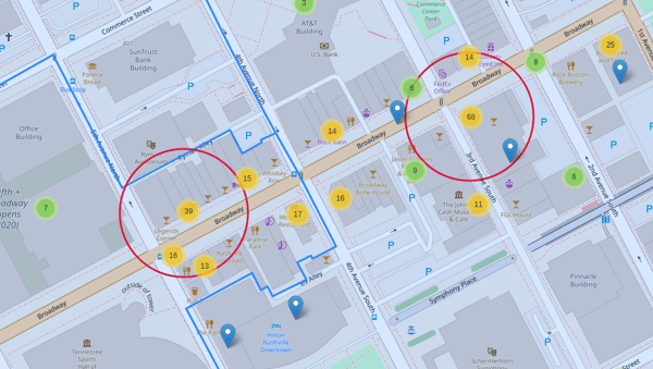
Metro Public Health has identified clusters of coronavirus cases, groupings of cases linked to a specific time and place as identified through the case investigation process. DS4 students looked at where reported violations occurred compared to where clusters had been identified, and found that a high volume of violations were reported downtown near Broadway between 1st and 5th Avenues. The blue, green, and yellow markers indicate potential violations or groups of violations reported to HubNashville and the red circles indicate identified clusters of COVID cases.
A full map is available here for further exploration.
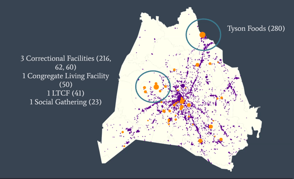
The purple points on the next map represent potential violations reported to hubNashville while the orange circles are locations where an identified cluster of cases took place. As would be expected, a large number of the violations occurred along the major business districts. Looking further from downtown, students identified several larger clusters of cases in areas where there was a lower number of violations reported. Inspecting these revealed that they occurred at locations which are not typically trafficked by the general public.
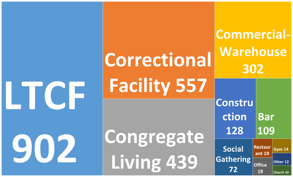
With so much attention on restaurants, churches, and other public gatherings, Maeva Ralafiarindaza of DS4 was surprised to learn that long-term care facilities and correctional facilities were the top spreaders, stating, “The violation offenders are not the top spreaders.” In fact, the top four spreaders when looking at all clusters were long term care facilities, correctional facilities, congregate living, and commercial warehouses, places which are largely unseen. Maeva’s team created the treemap below with Excel to show just how large the top four spreaders were compared to public areas and businesses.
DATA ANALYTICS PART-TIME COHORT 3
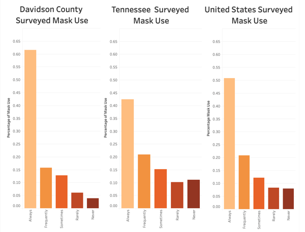
How does mask use in Davidson County compare to all of TN and the US?
DA3 students used survey data provided by the New York Times to compare mask use in Davidson County with mask use in other Tennessee counties and with counties across the US. The survey, conducted by Dynata between July 2 and July 14 asked “How often do you wear a mask in public when you expect to be within six feet of another person?” Their analysis showed that masking up in public has a better adoption rate in Davidson County.
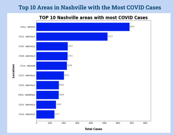
What areas have been hit hardest by the pandemic?
Students looked at residential zip codes for people diagnosed with COVID-19 between March 6 and November 17 in Davidson County to understand which areas have been hit hardest by the pandemic.
Finally, DA3 students also analyzed the proximity of violations reported to hubNashville and COVID-19 clusters as determined by Metro’s Health Department, finding 52 places of overlap. The map below and linked here shows the 52 locations where violations were reported and nearby clusters were later identified.
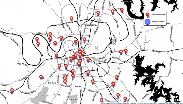
Dustin Bowen of DA3 shared his approach to mapping the overlap. “There was abundant data about reported COVID-19 violations — so abundant that it was difficult to track that through to real outcomes. So I worked backwards from publicly reported COVID-19 ‘clusters,’ or outbreaks of 10 or more confirmed infections stemming from a single location. The red pins on the map represent fifty-two publicly reported cluster outbreaks, for a total of nearly 2,600 confirmed cases of COVID-19.” The reported cluster outbreaks were then compared to the geolocation data in the violations report which are indicated by the purple circles.
Gaining Skills With Real-world Analysis
While this data gives us a better look at the impact COVID-19 has had on Davidson County, Veronica Ikeshoji-Orlati of DS4 explained some of the constraints her team discussed prior to their analysis.
"We knew that looking at Davidson county data alone, and particularly the safer-at-home violation reports, would only give us part of the picture of how COVID-19 is spreading in our community. In particular, we discussed how factors such as pre-existing conditions, age, race / ethnicity, language, immigration status, household size, income, profession, and access to healthcare and economic resources shape how vulnerable individuals are to COVID-19, as well as the fact that Davidson county does not exist in a vacuum and rising case counts in neighboring communities may drive what’s happening within our own."
The COVID-19 projects allowed both cohorts to practice their visualization skills and work on timely data questions. Veronica summed it up best, “I found it deeply rewarding to partner with my classmates to learn about something that is shaping our daily lived experience.”