This series features mid-course projects for our Data Science Bootcamp. Students were tasked with asking an interesting data question and finding a dataset to answer the question. Next, they spent time cleaning, wrangling, and exploring the data, before designing and building an interactive Shiny app.
For those without a measles vaccine, a nearby cough or a sneeze is anything but harmless. Those most vulnerable to this highly contagious virus are children under 5 years of age. If infected, they are at risk of pneumonia, brain damage, hearing loss, and even death.
In his Data Science mid-course project, Ryan Craven explored the relationship between vaccination rates, measles case counts, and healthcare expenditures. He built a Shiny app to visualize national and global findings.
“Prior to the introduction of the vaccine in 1963, there were estimated to be over 3 million cases of measles and over 400 deaths annually. With widespread vaccination and public health policies, measles was declared eliminated from the US population in 2000.” Ryan noted on his app. Nonetheless, small-scale outbreaks of measles still occur.
With a background in microbiology and experience working in public health, Ryan was motivated to find out what the data would reveal in terms of who is at risk of contracting measles.
“Hopefully this work can show the importance of routine vaccinations in preventing disease.”
THE DATA QUESTION
For his mid-course project, Ryan gathered data from the Organization for Economic Co-operation and Development, the World Health Organization (Global Health Expenditures Database and Measles and Rubella Surveillance Data), the Centers for Disease Control and Prevention (Notifiable Infectious Diseases and Conditions and School Year Vaccination Coverage, and UNICEF.
He aimed to answer the following question: How vaccination rates impacted prevalence and location of measles cases?
CLEANING THE DATA
Ryan used the R package Tidyverse for data cleaning. “The data had to be cleaned into a standard format for merging, often with pivoting to allow comparisons across years and datasets for each location,” he said. The biggest challenge was pulling data from various sources and “making sure there was enough overlap in years to be of value.”
VISUALIZING THE DATA
Explore Ryan’s Shiny app Measles: A Look at Vaccination Rates
His app allows users to toggle between the national and global level to interact with findings. Ryan used the ggplot and plotly packages to build the following visualizations:
- A choropleth map provides users a quick, geographic view of the data across states and countries.
- A scatter plot, through which users can drill down to a specific location for a more detailed view of the data.
Both the map and scatterplot enable the user to select between health expenditures per capita, measles case count, vaccination rate and year for a view of data trends over time.
THE RESULTS
Among his findings, Ryan discovered a link between healthcare spending and vaccination rates,
“On the global level, I found it interesting how countries with lower vaccination rates tended to have lower healthcare expenditures.”
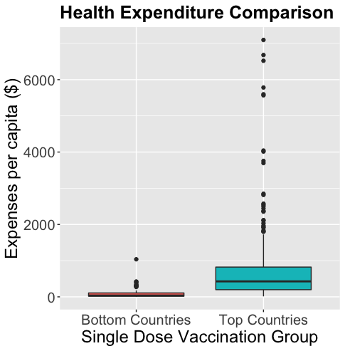 These boxplots show compare healthcare expenditures for the countries with the lowest vaccination rates (worst 5 for each year, 2000-2018) compared to the countries with the highest vaccination rates (countries at 99%).
Five years ago, California experienced a measles outbreak. Ryan’s data exploration and analysis showed a steep rise in vaccination rates after the outbreak.
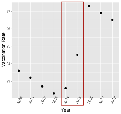 This scatterplot shows the rate of vaccination in California from 2009 to 2018. The red box highlights the years 2014 and 2015. The vaccination rate rose sharply during those years due to a measles outbreak in the state.